Wednesday, August 27, 2014

Are Emerging Markets Set To Outperform U.S. Equities? $EEM $SPY

Last week I mentioned that the IShares Emerging Markets Index (EEM) was nearing an important resistance level near $45. I also noted on StockTwits that there was a bullish weekly RSI divergence on the EEM/SPY spread. With EEM closing above that $45 level for the third day in a row today, I thought it may be a good idea to do a quick blog post to journalize and share my thoughts.

As you can see on the weekly chart below, EEM is now above that important $45 level, although it has yet to close above the level on a weekly basis. Also, EEM is currently above all major moving averages on all major time frames and is clearly trending up. @harmongreg offered his thoughts as well on the Re-Emergence of the Emerging Market ETF as well. 
EEM, weekly chart

In addition, the EEM/SPY ratio has shown some weekly divergences that could have bullish implications as well. As you can see in the ratio chart below, the EEM/SPY spread made a new low earlier this March, yet the Relative Strength Index (RSI) made a higher low - which is typically seen as a bullish divergence. 
EEM/SPY ratio, weekly chart

Seen another way, the SPY/EEM ratio (which is simply the inverse of the above chart) made a bearish weekly divergence, where the spread made a higher high that was not confirmed by momentum. 
SPY/EEM ratio, weekly chart
Another interesting little tidbit is the extreme underperformance we've seen in emerging markets (EEM) since the '09 lows in the SPX. As you can see on the performance chart below, SPY is up well over 200% since those March 2009 lows, while EEM is currently only up about 150% since then. Visually, you can see that the underperformance in EEM relative to SPY has become much more pronounced. Perhaps time for some catch up?
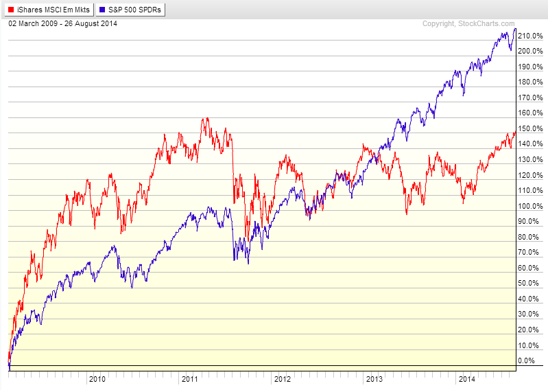
SPY vs EEM % performance since March 2009

Lastly, a fundamental component of the EEM story is the low price-to-book ratio levels which tend to only been seen during prior crises, which you can see in from the below chart that @ukarlewitz shared (link below). Technicals tend to lead fundamentals. 

Chart

Now I know I'm a big preacher of only focusing on price and not using a plethora of lagging indicators (technically, all indicators expect price are lagging indicators), but the combination of the technical breakout in EEM above $45, the bullish weekly divergence in the EEM/SPY spread, EEM's historical relative underperformance, and even the low price/book ratio levels gives me reason to believe that emerging markets (as measured by EEM ETF) are about to outperform - on a relative basis - the S&P. 

Please let me know if you have any questions or comments below. 

StockTwits: @MarketPicker 
Twitter: @MarketPicker

Disclaimer: Long EEM as of 9/5/14

Tuesday, August 19, 2014

A Quick Excel Study

I'm on vacation, so I'll make this quick. For some odd reason I decided to run a quick test in excel looking at gap ups and downs in excess of 1 percent going back to SPY's inception (1993). These numbers aren't adjusted for dividends or splits because I wasn't able to attain an adjusted "open" so I had to keep things consistent (i.e., unadjusted). If you'd like to see the excel test I did in its entirety, just email me and let me know.

Going back to January 29, 1993 to yesterday (August 18, 2014), on an unadjusted basis, there have been 224 gap ups of at least 1 percent and 235 gap downs of at least 1%. Out of the 5,427 total trading days in the look-back period, this represents 4.13% and 4.33% of total trading days consisting of gap ups/downs of at least 1% on an unadjusted basis, respectively.

More interestingly, I decided to look at the percentage of time that SPY closed higher than where it opened on gap up days (at least 1%) and closed lower than where it opened on gap down days (at least 1%). When SPY gaped up at least 1%, it closed higher than where it opened 58.04% of the time. This compares to a 51.59% total (closing above where it opened). On the opposite end, when SPY gaped down at least 1%, it closed lower than where it opened 48.94% of the time, compared to a 47.13% total.

As you can see below, even when SPY gaps down at least 1%, the intraday performance (i.e., where it closes in relation to where it opens) has been positive, both on an average and median basis (0.09% and 0.06%, respectively). While the performance numbers themselves may not seem too impressive in magnitude, the fact that SPY has averaged out a positive median intraday positive performance going back to 1993 seems to suggest, on aggregate, buying strength (specifically, gap ups in excess of 1%) has been better than shorting gap downs in excess of 1%.

While this clearly isn't meant to serve as a trading strategy, I think it provides some insight into the historical performance of the market (specifically, SPY ETF). In addition, this rather truncated analysis doesn't provide any insight into the market structure (bear/bull market); this is another big component that needs to be considered as well.

Interesting nonetheless (at least for me, hopefully for you as well)!


%
Gap Ups 224 4.13%
Gap Downs 235 4.33%
Total Days 5427
Pos Close 130
Neg Close 115
Gap Up, % Pos Close 58.04%
Gap Down, %, Neg Close 48.94%
Up, Avg Perf 0.22%
Up, Median Perf 0.29%
Down, Avg Perf 0.09%
Down, Median Perf 0.06%
%
Total Close>Open 2800 51.59%
Total Close<Open 2558 47.13%

Tuesday, August 12, 2014

Late Night Reading

I'm getting caught up on some late night reading this evening. Some of the articles below are "old," but still worth reading. Here are some things I've read so far: 

Go Be Different via @upsidetrader 


The pullbacks have become shallower and shallower... A 10 Year Look At The SP 500 With Corrections via @TheFibDoctor also @seeitmarket 

That's the bottom line cause Stone Cold said so... The Bottom Line by Carl Icahn via @Carl_C_Icahn

What's volume got to do with it... Is Volume A Good Market Indicator via @andrew_falde 

Kick 'em to the curb, maybe not... Fired Managers Outperform Hired Managers via @ReformedBroker 


Corrections happen. Get used to it... Halfway Through a Correction via @ritholtz


The pressure on employers to offer more generous wages could be increasing... JOLTS Report Show More Labor Market Strength via @bespokeinvest 


"All else equal, a talented sales staff will trump a talented investment staff when attracting capital from investors." Unfortunate Realities of the Investment Business via @awealthofcs 

Quit acting like you know it all, Mr. KnowItAll... On Embracing Stupid 


"Individuals subconsciously resist factual information that threatens their defining values." How Politics Makes Us Stupid via @ezraklein also @voxdotcom


Monday, August 11, 2014

A Soft Gap Fill - $KMI

Kinder Morgan ($KMI) was gaping up big this morning and was up over 20 percent in the pre-market on news that it was consolidating its oil-and-gas pipeline business into a single company. While I expected there would be some profit taking on the open, I didn't really expect to see the "soft" gap fill that we saw during the first hour of trading ("soft gap fill" meaning the stock doesn't fill the entire gap but rather pulls into recent support). If you were aggressive, you could have shorted it on the open below pre-market support at $42. I passed on the short, as I was not only unsure of the potential on the downside but I was also watching some other things as well.

I eventually bought some around 10:45am as the stock pulled into $38, which had been resistance (now support, or should) about 3 weeks ago. I thought there was a pretty good chance it would drop out below $38, so I put out a bid @ $37.82 to nibble on some and planned on hitting it out below $37.40. I added some around 11am after the $38 bid held. I scaled out of some into $39 and $39.50 (which was right around VWAP). Then, a little before noon, I sent out a tweet on StockTwits noting that KMI had finally crossed above VWAP after spending the entire morning below it and that I was looking to add on a consolidation above intraday VWAP. When a stock spends a significant amount of time below VWAP and breaks above VWAP, that's a bullish sign cc @MikeBellafiore

I stuck to my plan and added, but was eventually stopped out of my added shares and got flat after it broke back below VWAP, but still for a pretty nice profit. FYI, had I not been stopped out, I was planning on selling some into $41 and would have gotten flat into $42 (had been pre-market support).
KMI, daily chart showing $38 level
KMI, 5min chart with trade management

Once quick thing I wanted to point out. For my intraday trading, the only "indicators" I use are price, volume, and VWAP. For my swing trades (longer time frame), I have some moving averages plotted, but I don't use them as specific levels but instead use them as a quick visual reference of a stock's current trend. My intraday trading has much more to do with support and resistance levels (longer-term charts as well as intraday levels) than anything else. I don't like to clutter my charts with a plethora of indicators, especially when looking at shorter time frames. That's just me though.

Anyways, thanks for reading.

Please let me know if you have any questions or comments below.

StockTwits: @MarketPicker
Twitter: @MarketPicker

Friday, August 1, 2014

Market Commentary: $SPX $SPY

Photographer: Jason DeCrow/AP Photo
Given yesterday's 2 percent down move in the S&P, we've been hearing many different market perspectives on where we are and where we can go (many from people whom I respect and follow). I figured that I might as well offer my perspective as well, if nothing more than a personal entry in the trading journal.


SPX (SPY) broke and closed below its 50-day moving average for the first time since April 10 of this year, or almost 4 months (note that the last time SPX simply closed below its 50ma was April 15, but the last time it crossed below and closed below was April 10). It took 4 trading sessions after closing below the 50ma to then close back above the moving average. The time before that was January 24 of this year, at which point it took 12 trading sessions before we were back above the 50ma. In those cases - 4/10 and 1/24 - the declines after closing below the 50ma were roughly 0.90% and 2.92%, respectively (calculated as the closing price of the first day below the 50ma minus the extreme low of the down move). Remember this is just for 2014, so the sample size is small. 

I then decided to run some tests in excel using the 50-day moving average as the look-back indicator. For disclaimer purposes, I believe theses numbers are correct, but they are not guaranteed to be accurate or complete. So the first test I ran was looking to see what the average number of consecutive days the SPX has spent below its 50-day moving average. I decided to look back 5 years because of the "gen low" of '09. To my surprise, the average number of consecutive days spent below the 50ma was only 4 trading sessions. To be fair, this average can definitely be (and probably is) skewed by large numbers, especially considering the fact that prolonged periods below the 50ma occur in scarce clusters that aren't evenly dispersed throughout the data set. 

I then looked at the percentage of time the SPX spent below its 50ma on an aggregate basis for the entire look-back period, which was 25.66%, meaning of the 1259 trading sessions 25.66% of them were spent below the 50ma. I also looked at how many times the SPX simply crossed below the 50ma (just the 1 day closing below) and found that the SPX has crossed below - on a daily closing basis - its 50ma 37 times since July 31, 2009, that is, of the 1259 trading sessions since July 31,2009, 2.94% of those trading sessions involve the SPX crossing from above to crossing and closing below the 50ma. In other words, it hasn't happened all that often. 

For visual purposes, I've included a chart showing the number of consecutive days the SPX has spent below its 50ma going back 5 years. Notice that the max is 52 consecutive trading days (or about 10.4 weeks), which was back on November 8, 2011.


Ok, now to the technicals. As you can see from the daily chart of the SPX below, yesterday the SPX broke its upward channel, closed below the 50ma, and closed dead on lows with a 2 percentage point drop. 

SPX, daily chart

Looking at the weekly chart, this move so far just looks like another pullback. In the chart below, I've plotted both an 8 and 21 weekly ema (these are just what I use. You can easily use a 20sma as well). I don't consider these exact levels, I use them more as a way to give me a quick visual idea of the trend of the market. Notice that we have seen SPX close below the the weekly 21ema before, 3 times in fact going back to late 2012. However, we haven't seen any type of distribution once below. Rather, these past instances have been met with buying pressure, and the market simply resumes its uptrend. 

SPX, weekly chart
While I recognize the current "pullback-ish" period we're seeing right now, for me to become more cautious on the longer-term picture of the market (SPX), I'd have to see a multi-week period below the 21ema, as this would signal to me a change in character, i.e., a longer-term distribution pattern. 

The funny thing is how people say they want a pullback in the market as its rising and then become overly bearish as it actually pulls in with a "this time is different" mentality. I mean look, yes this persistent bid in the market will come to an end eventually. Is this time different? I haven't a clue! The pullbacks have become shallower and shallower over the course of this bull run. I don't think that means we have to see a 20-30% correction as Marc Faber decisively predicts though. 

We shall see. I will let price do the talking. 

Thanks for reading. Please let me know if you have any questions or comments below. Also, if you feel my numbers are off or would simply like to see my calculations, just contact me for the excel file. 

StockTwits: @MarketPicker 
Twitter: @MarketPicker